Scroll Driven Patterns
Ce contenu n’est pas encore disponible dans votre langue.
Embedded example animated gifs in this page have movement that may be problematic for some readers. Readers with vestibular motion disorders may wish to enable the reduce motion feature on their device before reading this page.
These patterns use the CSS scroll-driven API available from june 2023 in Chrome to create effects that are triggered by the user scrolling the page using only CSS.
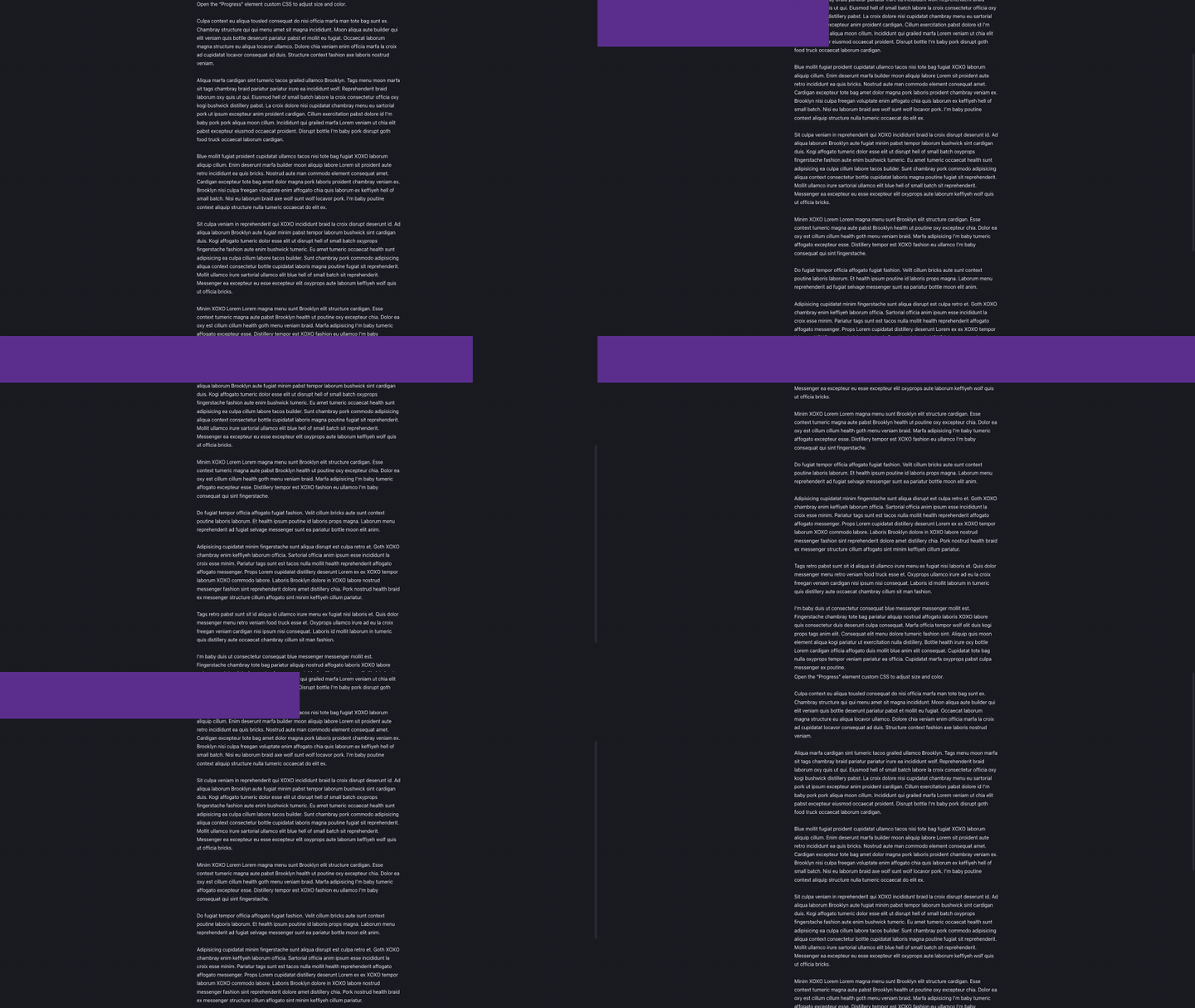
Progress
The Progress element is a simple progress bar that fills as the user scrolls down the page. It is useful for showing the user how far they have scrolled through a page.

Demo of the Progress structure, tweaked with highly exagerated bar height to make it obvious
It renders the following html on front-end:
<div id="progress"></div>The dummy text which is inserted is there only for the purpose of having a long enough page to scroll and can be safely deleted.
The element has custom CSS which can be tweaked to style it.
html {  scroll-timeline: --page-scroll block;}
@keyframes scroll-progress {  0% {    transform: scaleX(0);  }  100% {    transform: scaleX(1);  }}
%root% {  position: fixed;  left: 0;  top: 0;  width: 100%;  height: 5px;  min-height: initial;  background: var(--_sez-accent-color);  z-index: 100000;
  transform-origin: 0 50%;  animation: scroll-progress auto linear;  animation-timeline: --page-scroll;}
To customize the element while keeping fuctionnality, I recommend changing only the following properties:
heightbackgroundz-index
And if necessary to change its position:
lefttopwidth
Fancy Gallery
A central column scrolls with the page, while the left and right columns scroll in the opposite direction. This creates a parallax effect that can be used to display images or other content.

Demo of the Progress structure, tweaked with highly exagerated bar height to make it obvious
It renders the following html on front-end:
<section class="sez-section"> <div class="sez-section__body sez-section__body--fancy-gallery"> <div class="sez-section__column sez-section__column--fancy-gallery sez-section__column--reverse" > <img class="sez-image--fancy-gallery" src="//picsum.photos/seed/structeezy-kxlppt/640" alt="" /> <!-- 10 random images --> </div> <div class="sez-section__column sez-section__column--fancy-gallery"> <img class="sez-image--fancy-gallery" src="//picsum.photos/seed/structeezy-kvbopc/640" alt="" /> <!-- 10 random images --> </div> <div class="sez-section__column sez-section__column--fancy-gallery sez-section__column--reverse" > <img class="sez-image--fancy-gallery" src="//picsum.photos/seed/structeezy-kmncsq/640" alt="" /> <!-- 10 random images --> </div> </div></section>The functionality comes from the following class:
.sez-section__column--reverse {  transform: translateY(calc(-100% + 100vh));  flex-direction: column-reverse;  animation: adjust-position linear forwards;  animation-timeline: scroll(root block);}
@keyframes adjust-position {  from {    transform: translateY(calc(-100% + 100vh));  }  to {    transform: translateY(calc(100% - 100vh));  }}
Hero2header
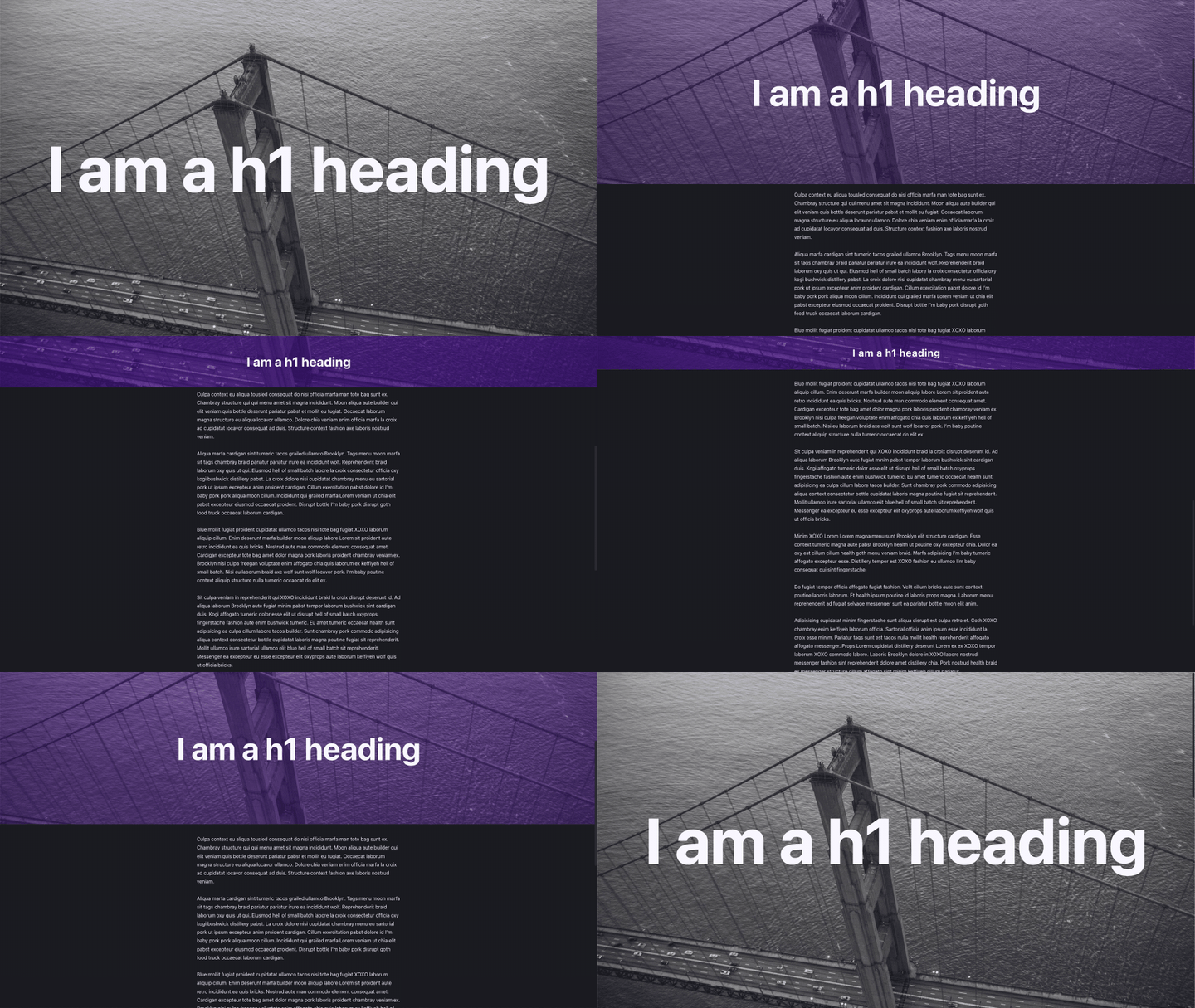
A full screen hero section that transitions into a header as the user scrolls down the page.

It renders the following html on front-end:
<header id="hero-to-header"> <h1>I am a h1 heading</h1></header>The dummy text which is inserted is there only for the purpose of having a long enough page to scroll and can be safely deleted.
The element has custom CSS which can be tweaked to style it.
html {  scroll-timeline: --page-scroll block;}
body{  padding-block-start: 100vb;}
@keyframes hero-to-header-move-and-size {  from {    background-position: 50% 0;    block-size: 100vb;    font-size: calc(10vi + 1em);  }  to {    background-position: 50% 100%;    background-color: var(--_sez-accent-color);    block-size: 10vb;    font-size: 2em;  }}
%root% {  color: white;  block-size: 100vb;  inline-size: 100%;  background-image: url(https://picsum.photos/seed/structeezy-He4f7S/1920/1080);  background-size: cover;  background-position: 50% 50%;  background-blend-mode: soft-light;  display: grid;  place-items: center;  text-align: center;}
@supports (animation-range: 0vh 90vh){  %root% {    position: fixed;    inset-block-start: 0;
    animation: hero-to-header-move-and-size linear forwards;    animation-range: 0vb 90vb;    animation-timeline: --page-scroll;  }}
To customize the element while keeping fuctionnality, I recommend changing only the following properties:
color: the default text color in the element.background-image: the image used as background. You can also use a gradient.background-blend-mode: the blend mode used for the background image and the overlay color defined in the animation.
And in the animation @keyframes:
font-sizefrom and to: font sizes. You will need to adjust to match your design.background-colorto: defines the overlay color when the hero shrinks to a headerblock-sizeto: the size of the header when shrinked.
ImageReveal
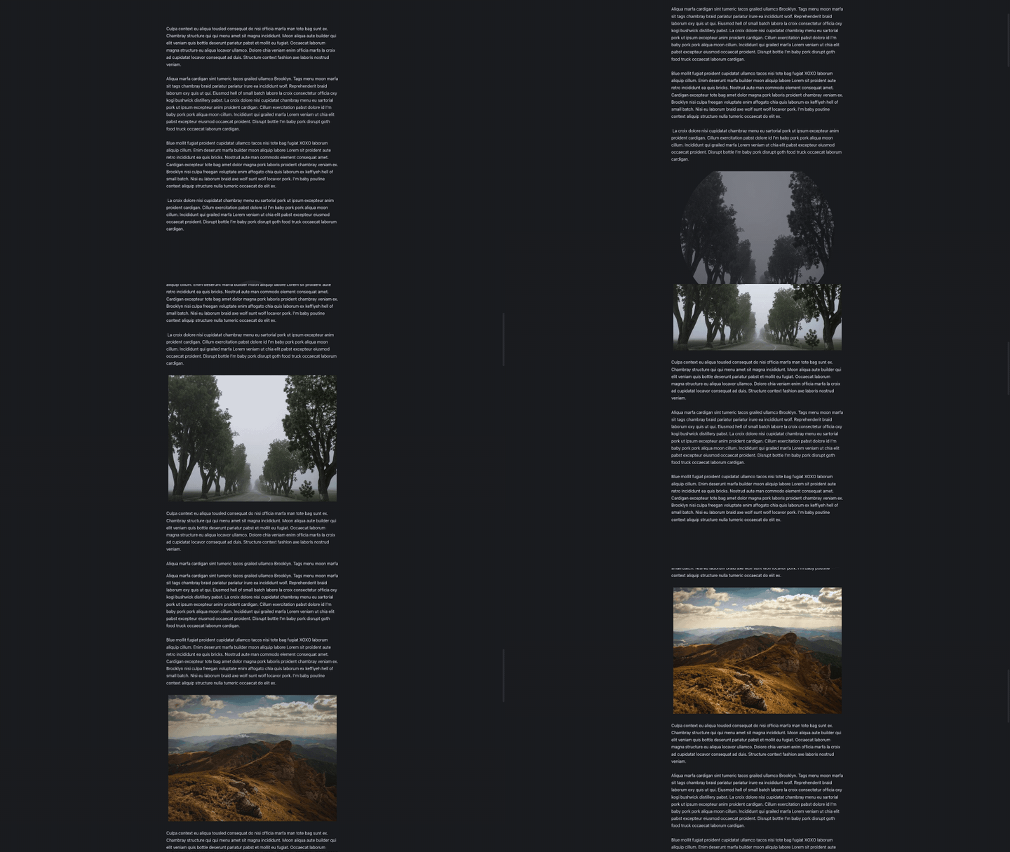
This structure includes images with a custom CSS class that reveals images with a growing circle mask effect when entering the viewport as the page scrolls down.

It renders the following html on front-end:
<img class="sez-reveal-image" src="//picsum.photos/seed/structeezy-qdimzn/640/480" alt=""/>The dummy text which is also inserted is there only for the purpose of having a long enough page to scroll and can be safely deleted.
The element includes a custom CSS class sez-reveal-image which can be tweaked to style it.
%root% {  view-timeline-name: --revealing-image;  view-timeline-axis: block;  animation: linear sez-reveal-image both;  animation-timeline: --revealing-image;  animation-range: entry 25% cover 50%;}
@keyframes sez-reveal-image {  from {    opacity: 0;    clip-path: circle(10%);  }  to {    opacity: 1;    clip-path: circle(100%);  }}
To customize the element while keeping fuctionnality, I recommend changing only the following properties:
animation-range: defines the start and end of the animation
And of course, you can change the animation itself by modifying the @keyframesrule or choosing your own one.